

Designed by DZINE MAFIA, United Kingdom.
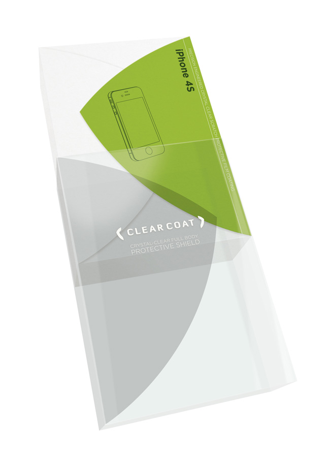
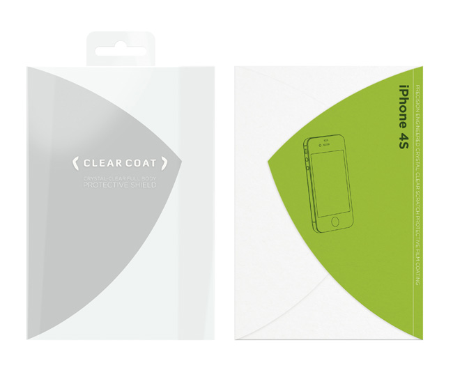
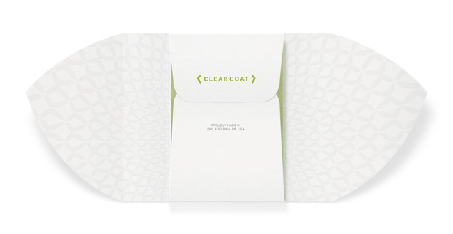
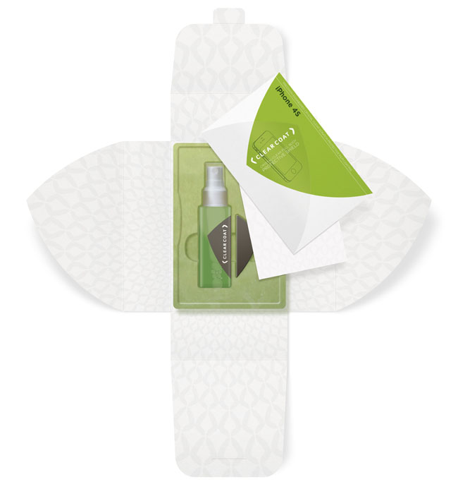
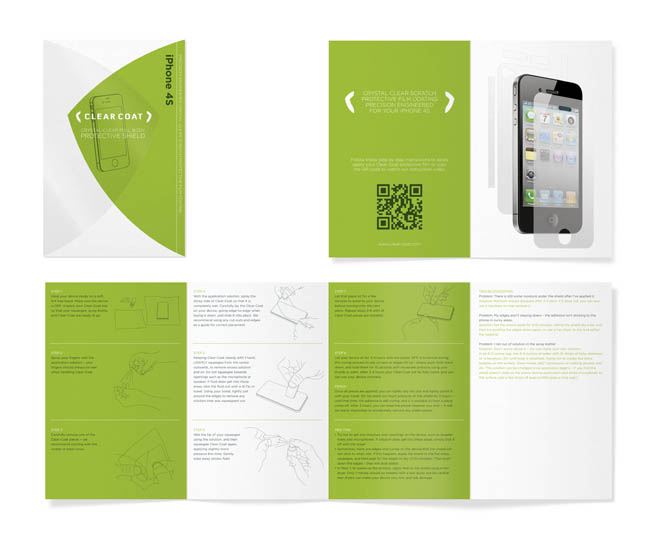
The final result (concept only) is very different from the existing Clear Coat packaging. It’s freshened it up, given it a bold look on shelf and a premium feel in the unpacking process. The design uses a shield graphic that really sums up what Clear Coat is all about – a strong, protective defense that will take all the cuts and scratches you can throw at it to safeguard your device.
The packaging concept shows this in a contemporary graphic style, with two dynamically curved shapes overlapping to create a shield that encompasses and protects the illustration of the device. The information is kept minimal allowing the eye-catching green arrowhead to stand off the white background, creating a strong and daring brand look that jumps off the shelf. Clear, bespoke instructions along with a QR code to an instruction video give the consumer a friendly and considered feel, instilling the thought that as the product is presented well, so it will act well.



Simple and clean packaging. Good color combination as well.
ReplyDelete