Design: Free The Birds
Location: United Kingdom
Project Type: Produced
Client: wilko
Product Launch Location: United Kingdom
Packaging Contents: Paint, Pet food, Garden materials
Packaging Substrate / Materials: Aluminium, plastic
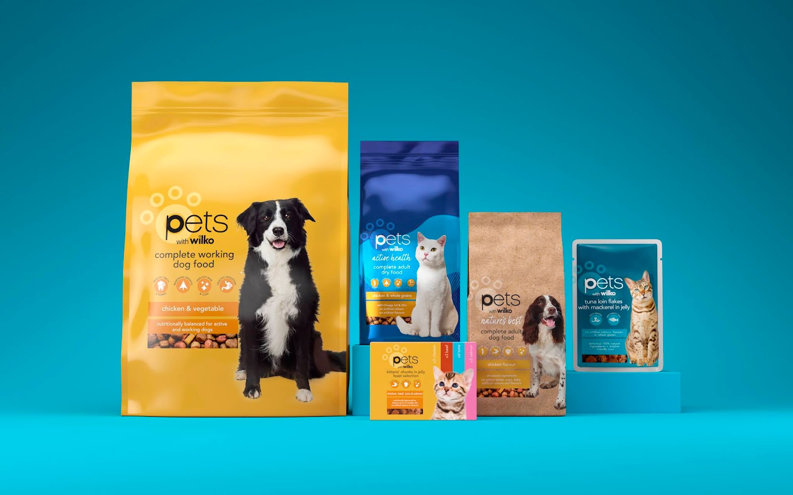
wilko has today unveiled a bold new brand positioning that will unify its own lines under the same identity for the first time, thanks to creative agency Free The Birds. Beginning with its heritage paint and pet ranges, the brand re-fresh is part of a three-year partnership that will see Free The Birds’ designs rolled out across the company’s entire portfolio, showcasing wilko’s position as one of the British highstreet’s best-loved home and garden retailers.
The reinvigorating new work brings brand architecture, packaging design, typography, illustration, tone of voice and photography together to celebrate wilko’s 90-year heritage under one brand equity.
Embracing the retailer’s connection with hard-working families, distinctive and flexible assets have been both revitalised and introduced afresh, to give the brand a more contemporary feel. The new packaging design sees the brand architecture shift to a consistent and easier navigation system with wilko’s logo at the top, followed by the product name below. Other elements of the design include the introduction of clear iconography on the front-of-pack to call out the product’s USPs, as well as navigation bars at the bottom to aid simplicity and browsing on the physical and digital shelf.
Nick Vaus, Partner and Creative Director at Free The Birds said: “With a portfolio of this size, we had to create a consistent brand thread across varying labels that is delivered simply and effectively. We developed three overarching design structures ‘Core’, ‘Core Light’ and ‘Core Plus’ to help customers distinguish the different ranges. For the Paint and Pet labels, we introduced a coherent colour scheme and photography to offer a level of intimacy with consumers, making wilko feel both engaging and ownable in a crowded category.”
The on-pack typography has been softened to exhibit an encouraging, playful and assuring tone of voice, while still ensuring that product information is clearly communicated. Free The Birds also developed a new label strategy to differentiate the heritage wilko products from specific ranges such as ‘pets with wilko’ and ‘care with wilko’. Meanwhile, the classic tittle (“.”) which features in wilko’s main logo has been replicated across all the category labels, to convey a sense of unity with wilko’s consumer set. The updated visual strategy will be implemented across the nine labels, totaling approximately 15,000 stock-keeping units (SKUs).
“Our challenge was to elevate and evolve wilko’s brand identity to reflect its values and product attributes of durability, ease of use, performance and accessibility. By creating a layered design system with a specific colour palette and messaging on pack, we ensured that the new branding works across the vast range of structures and substrates within wilko’s full portfolio, while helping customers make the right choice and simplifying the brand’s internal processes'' added Nick Vaus from Free The Birds.
Racheal Leonard, Head of Brand & Marketing from wilko added: “After conducting a survey with our customers, we realised the need for a brand refresh that highlights product benefits and eases navigation on shelves. We were looking for an agency that could strengthen our existing equities, and truly enhance our presence on the shelf. We can’t wait to introduce the new look to our customers, who we’re sure will be delighted with the results.”
The updated branding extends across all touchpoints including identity, packaging and website, and will be rolled out nationwide over the next three years.


0 comments : wilko
Post a Comment
STRICTLY NO SPAM. Tell us what you think about this packaging project. No external links allowed, all comments with links will be marked as spam.