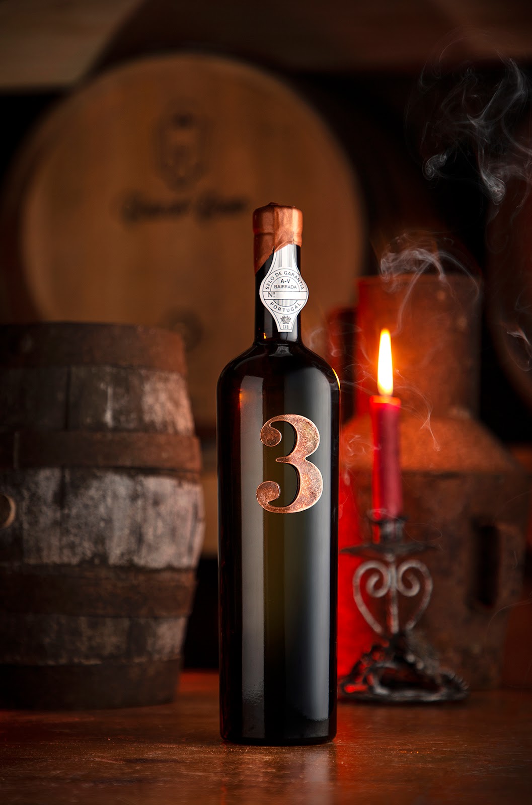
Design: M&A CREATIVE AGENCY
Location: Portugal
Project Type: Produced
Client: Casa do Canto
Product Launch Location: Global
Packaging Contents: Wine
Packaging Substrate / Materials: Bottle, Label, Printing, Metal, Wax
Printing Process: Serigraphic Printing and Metal Tooling
The creative storytelling is real, three friends picked three french oak barrels, and let the wine rest for months. Our design concept expressess their character and soul, bringing to life the number 3 as a symbol of their union and friendship.
We always wanted to blend metal and direct printing techniques in a wine bottle. When you believe in the concept of “less is more”, the result can only be described by the beautifull combination of these techniques.
Some will love, some will hate..but for the most, its Perfect! The dream came true.


.jpg)


0 comments : Less is More
Post a Comment
STRICTLY NO SPAM. Tell us what you think about this packaging project. No external links allowed, all comments with links will be marked as spam.